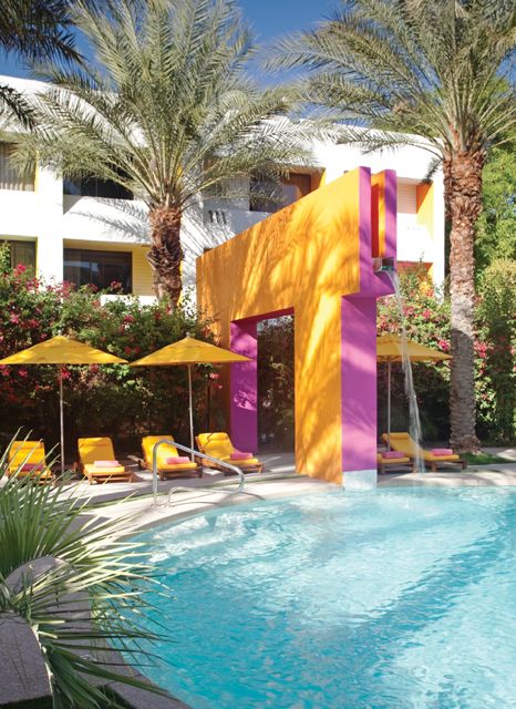
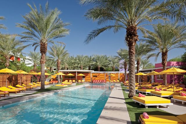
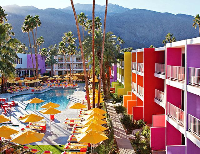
 The vibrantly hued Saguaro in Palm Springs is proof that color can totally transform a space. Formerly a bland Holiday Inn, the 70s motel is now thriving in its reincarnation as a hip hotel (it was the hot place to stay for Coachella). Architects Paul Aferiat and Peter Stamberg chose 12 brilliant hues found in native desert wildflowers for the hotel’s eye-catching palette. For those of you faced with uninspiring spaces, there’s lots of fun design ideas here as well as from the sister hotel the Saguaro in Scottsdale, Arizona:
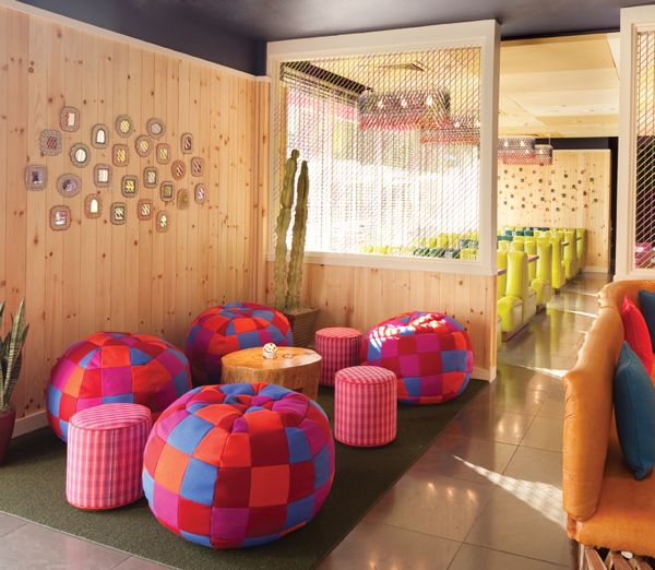
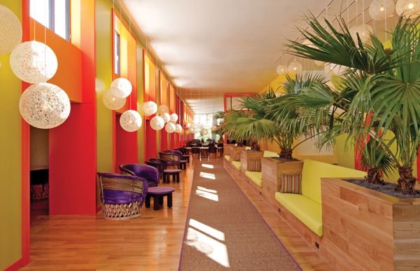 COLOR BLOCKING INTERIORS: The colorblocking trend that’s been happening in fashion is successfully translated to interiors here. It’s proof that unexpected combinations, like the red, yellow and purple lobby lounge, can bring a bland space to life. This would be a great palette for a room with little natural light–a basement or a mudroom would look great in this vivid color combination.
COLOR PUNCTUATION: Brightly colored upholstery pops against a neutral backdrop of light wood planked walls. But it is the charcoal ceiling that gives the space a more sophisticated spin. Also note the wall collage of mini mirrors–a fun and inexpensive DIY idea.
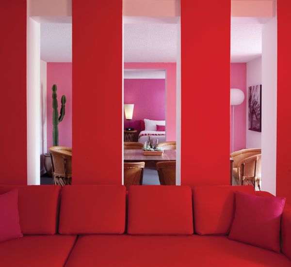
NATURAL INSPIRATION: I recently interviewed a decorator who said that colors found in nature can’t clash, and the above space is proof of that. The open plan in the suite above lets you peer from living to dining to bedroom, going from red to pink to lavender. It’s a combo I would normally steer clear of, but given that Aferiat Stamberg got their palette from local wildflowers, it somehow works.
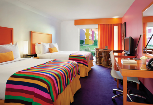
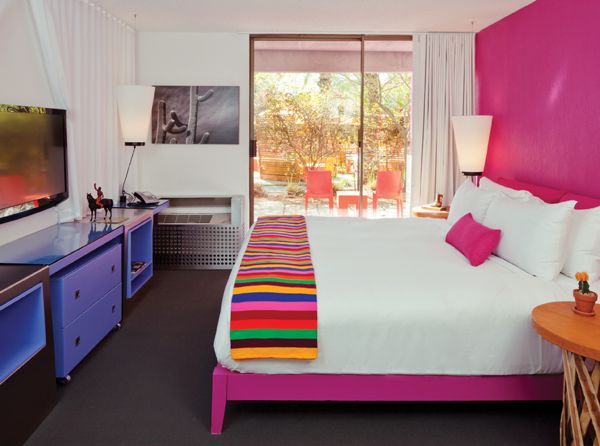 COLOR WALL: When you want to use an especially intense color on the walls, painting just one wall is a safer way to go. Especially in a small room like the this one, having the whole space be hot pink would be dizzying. But done on one wall it jazzes up the room distracting the eye from the small square footage.
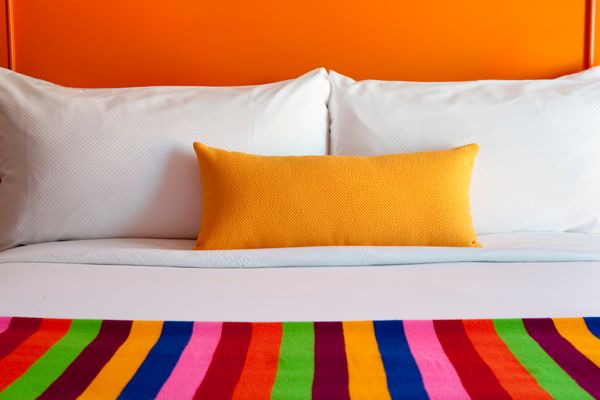
STRIPES PULL IT ALL TOGETHER: When you are using several strong colors in one space, it’s helpful to have one print or pattern with those same hues to pull it all together. Here, throws with orange, purple, and pink stripes unify the room’s quirky palette.
BRIGHT EXTERIOR: When you have 70s architecture to contend with, your best bet is to mask the problem with bright color. Especially in a tropical setting, vibrant color combinations like pink and orange are awesome when used on a building’s exterior.
Happy poolside chic.
Photos: Tim Street Porter Courtesy of the Saguaro

