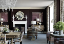
 In terms of boutique hotel design, it is almost impossible to top the Viceroy in Santa Monica. The dramatic details, unique styling, sexy color scheme, and 1940s Hollywood inspiration showcase design star Kelly Wearstler at her best. So many great ideas to make your own here, and many of them can be done on the cheap.
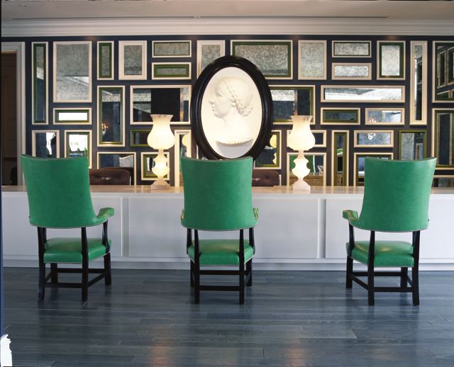
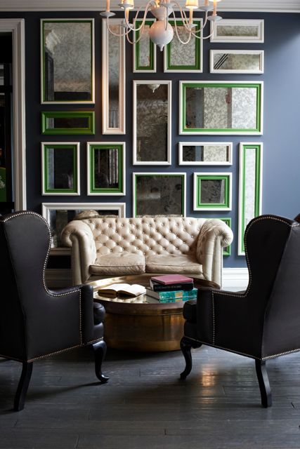 FRAME MIRRORS AS ART: Arranged gallery style, this is a chic, wallet friendly art idea. There are a couple ways to do this. An easy way is to gather a variety of frames at the flea market and unify them by painting them the same color. Then go to a glass and mirror supplier and get mirrors cut to fit. The ones at the Viceroy are antiqued which creates that cool, smoky look. If you are more crafty, you can create your own frames from decorative moldings in a variety of shapes and sizes. Then paint. Notice how the frames with additional trim are done in bright green. PS-Slate blue, cream, brown, pop of green would be a gorgeous color scheme for a dining room, or a den.
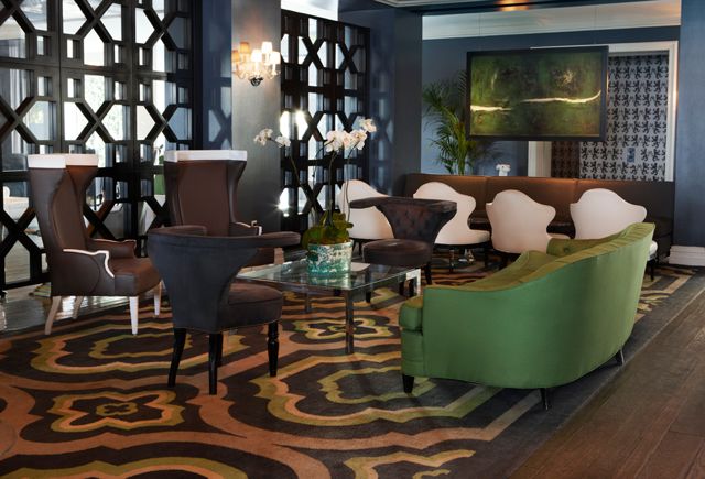 ART AS ROOM DIVIDER: Here, a framed painting hung from ceiling, provides a unique way to divide the space from a hallway. I love how unexpected it is to hang art this way so that it looks almost suspended in air. It creates the illusion of a wall where there is none, without enclosing the space which would make it seem smaller.
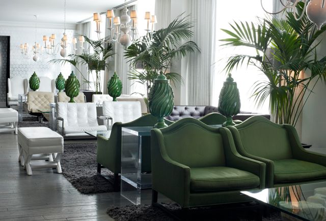 GREEN FABULOUSNESS: The lobby provides amazing inspiration for a glam living room. The graphic print, metallic wallpaper sets the tone. Metallic papers have the added benefit of bouncing light off the room, making any space seem larger. Lucite and glass tables are also a great choice if you are trying to decorate a small space. Since they are clear, they don’t block your sight line making a tight furniture arrangement seem less cramped. The green chairs and green glass accents rev up the glam factor paired with neutral white and leather sofas and chairs.
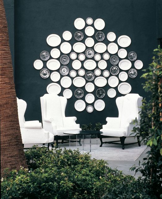 HANG YOUR PLATES: Another great design idea that can be easily recreated using plates that you can pick up on the cheap at the flea market. Love the combo of oval and circular white plates along with more traditional scenic dessert plates. What makes it look more modern is the graphic arrangement set against a dark wall. This would be fun to try in a kitchen or dining room, it’s also unexpected and playful done outside on a deck or porch as it is shown here. PS–Love the look of traditionally “indoor” furniture like wing chairs set outdoors–they provide an incredibly comfy and unexpected perch.
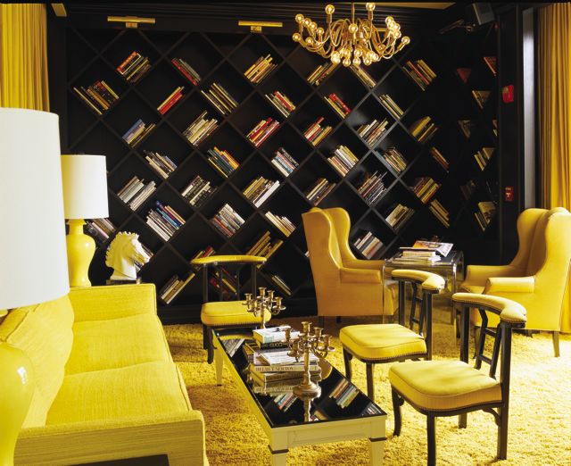 TURN YOUR BOOKCASE ON ITS SIDE: By turning the placement of square shelves on its side, the bookcase gets an instant update. A carpenter could easily recreate this design along an entire wall or create a smaller version. PS-The tone on tone color scheme of the library is a smart palette option for someone who is in love with one color and wants a glamorous way to bathe a room in it.
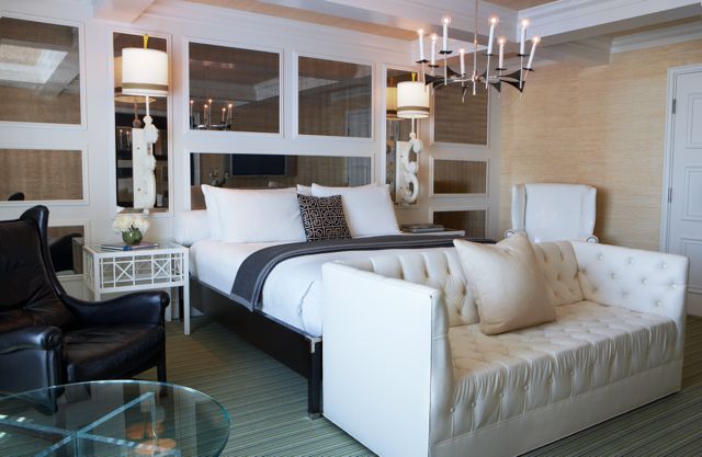 USE MIRRORS TO JAZZ UP A WALL: Without a traditional headboard, Wearstler placed a long bolster behind the pillows for comfort, letting the mirrors be the focal point. If you look closely, the look is created just simple with decorative moldings paired with rectangular and square mirrors of varying sizes. PS: Grasscloth wallpaper is always soothing. Notice how it is also applied on the ceiling too, creating a lovely focal point to wake up to
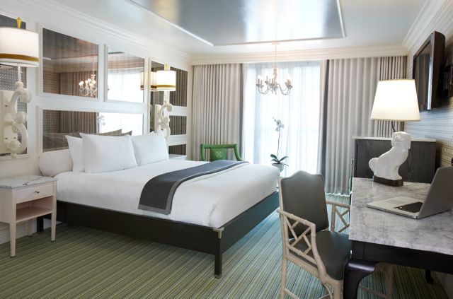 RIBBON YOUR LAMPS: Brown ribbon placed not quite at the bottom of a simple shade, gives them a sophisticated update. The same idea, a brown border placed not quite at the ends of plain white curtains, turns them from blah to beautiful.
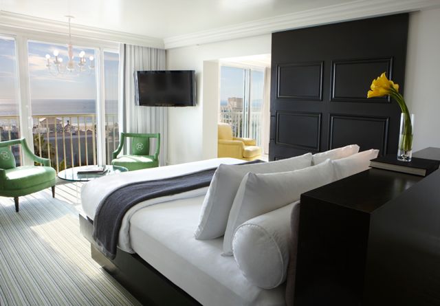 PAINT DOORS BLACK: Imagine if the sliding door of this suite were white. It would be pretty boring. But the same door covered in glossy black paint turns it into a gorgeous architectural element in the room.
All images courtesy of the Viceroy Santa Monica

