 I am absolutely in love with everything about the JK Place Capri, which shouldn’t really come as a surprise as the Italian designer and architect Michele Bonan is the genius behind the design. Michele also did the glamorous Hotel Continentale and Germany’s Heidelberg suites which I recently paid homage to. I think Michele and Kit Kemp, are the most innovative hotel designers right now. They both understand that savvy travelers want to stay at hotels that feel original and unique, where design and getting lost in it, is as important as service and location. At the JK Place Capri, the sister hotel to the JK Place in Florence, 22 individually designed rooms are perched in a c. 1875 mansion above the Mediterranean.
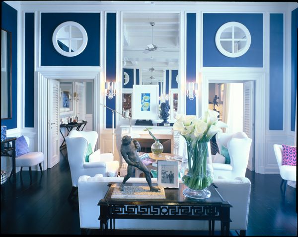
 Michele has some signature design moves here, that you will recognize from his other projects. He is a fan of wing chairs and crisp white furniture which he designs himself. He loves pairing modern art with more traditional sculptural busts. He pays attention to every detail from incorporating exquisite molding to installing stunning floors. And he somehow manages to add columns and not have them feel staid and stuffy. However, even with these design threads, his spaces all feel incredibly fresh.
 If you love the rugs throughout the hotel (and many of the upholstered pieces), most of it is designed by Studio Bonan, Michele’s firm and can be ordered through them.
 All of the paint colors are custom mixed by Bonan, including this perfect blue that echoes the sparkling sea that the hotel looks out onto. The houndstooth vintage stools beneath an early 20th-century Chinese console are from Flair. So many design ideas here to crib! Read on for more:
 Mix Modern and Classic Art: Here, contemporary architectural photographs by Massimo Listri and a traditional roman sculpture play off of each other. Classic maps hung on a wall overlook crisp vintage, black and white photographs. It is a reminder to mix styles and periods of art for a dynamic result.
 Replace White Lampshades with Black Ones: Ditch the traditional white shades in favor of way more dramatic black. Imagine how this room would look different if the shades were white? It wouldn’t be nearly as cool. An easy switch that modernizes a space. Estro Fiorentino manufactured the dazzling chandelier, it is from the Michele Bonan Collection and called Juliette
 Stain floors dark for dramatic effect: Dark floors are one way to update a room. Here, paired with grey walls and white chairs the rich floors look amazing. I love this color scheme for a dining room. The ring back chairs are designed by Bonan and look very similar to the houndstooth ones he created for the 1 Place Vendome restaurant in Paris.
 It’s all about books: The library at JK Place Capri features books on design and travel, along with bound editions of Domus. A well-chosen library of books always adds style to a space, and is a smart way to make a hotel feel more homey.

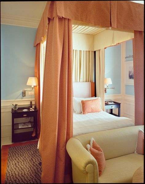
 Tiffany Blue Plus Coral=Fabulous: An entirely unexpected and fresh color combination, I love how the coral accents pop against the pale blue walls. The beige and raffia upholstery, on the chairs and sofa, keeps the look from being too Florida retirement community.
 Add Pattern to Your Canopy: While each room in the hotel is different, several have these canopies with a small graphic pattern on the outside and a crisp white and colored edge inside. It is a smart idea if you love prints, but want something more soothing to look at when you are relaxing in bed. The coral blue canopy print is Allure by Dedar. China Seas Java Java also has a similar look.
 Mix it up with a Zebra Print: The zebra print stool here makes a bold style statement and prevents the room from feeling too nautical. Without it, the room wouldn’t feel nearly as glam.
 Mirror it Up: A sleek mirrored chest sits on top of these stunning white herringbone floors, with a gorgeous room design to reflect. Especially in light rooms, just one or two pieces of mirrored furniture, is a dazzling addition to a space.
 Grasscloth wallpaper always adds depth to a space. Done in a deep yellow the wallpaper makes a strong style statement.
 Furnish the Bathroom: Bathrooms are often overlooked, but the addition of one or two comfortable and stylish places to rest and put your feet up, makes the space feel more like a retreat.A vintage raffia covered 1950s chair and a chrome stool, provides a comfortable place to perch.
 In Love With Ikat: While elsewhere the wingchairs are all white, this pair in purple ikat from Dedar steals the show. The seats are kept white to keep the look crisp. They are a great example of how a colorful bold print is all it takes to make a classic piece of furniture look entirely new.
The deck and the pool at the hotel. 
 Here’s to daydreaming…..


