 Great hotels offer you the wonderful fantasy that you live in a place that’s a bit cooler, more cutting edge, more exotic, or more luxe than your real life digs. The best hotels take things one step further giving you a feel for what it would really be like to live in a countryhouse mansion, or a Indian castle, or in the case of Thirty Two, a gorgeous Regency townhouse in a charming English town on the edge of the Cotswalds. Which sounds absolutely heavenly to me.
 The vision of two talented interior designers, Jonathan Parkin and Jonathan Sellwood, the duo gave the hotel’s interiors a magical mix of oriental, mid-century, old and new pieces. With a wonderful sense of color paired with bold and beautiful patterns, each space in the 4-room boutique hotel feels luxurious and homey at once. If you fall in love with the design, you can order many of the pieces through Jonathan and Jonathan. So many great ideas to crib here, read on to bring the best of Thirty Two home:
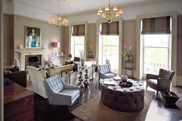
TRY PINK INSTEAD: How gorgeous and unexpected is this dusty pink/mauve shade for the living room? It manages to add a subtle dose of color, while still being sophisticated. Next time you think about painting a living room beige, think twice, this is a very cool option colorwise. Silk effect vinyl wallpaper from Casamance gives the space added warmth. The insanely fab steel and leather chests hail from Andrew Martin.
Mix Time Periods: Rather than going with a traditional, formal dining set, the designers scored these mid-century chairs and table on eBay. The contrast with the classical Regency architecture injects a fresh energy into the space. The chairs are reuphostered in a retro style fabric from Casamance. Another great design idea here? The silk wrapped pleated shades–instant glam.
A Safer Way to Go Bold: How often do you fall in love with a bold patterned wallpaper, but then get nervous that it will overpower a room? Here, the stunning Hicks’ Hexagon wallpaper from Cole & Son covers only one wall behind the headboard, while the rest of the room is painted in a shade that was matched to the wallpaper’s background hue. It’s a very clever way to get a chic and seamless look in a bedroom without committing to a daring pattern on every wall.
VISUALLY CONNECT YOUR ROOMS: If you live in a small apartment, creating visual links from one room to the next by using the same colors and patterns, actually makes your space look larger. Here, the amazing Magnolia wallpaper from Cole & Son that lines the wall behind the bed, is also found on one wall in the master bathroom. Same goes for the soothing greige paint color, Dulux Pebble Mosaic 3.
FROM BATH TO BED: OK, so in the real world having a gorgeous tub in the master bedroom is an idea that you will either think is incredibly relaxing and sexy, or it just won’t make sense to you. Regardless, this copper tub is showstopping and hails from William Holland.
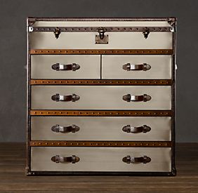
If you like the look of the Andrew Martin Steel/Brown Chest of Drawers in Thirty Two’s Living Room check out the…..
Restoration Hardware’s Mayfair Chest in Brushed Steel
Cole & Son’s Hicks’ Hexagon appears in one of Thirty Two’s chic guest rooms. If you want the look for less check out….
The Brewster Geometric wallpaper available at Home Depot

If you are an intrepid DIYer, check out this cool weekend project inspired by the Hicks’ Hexagon pattern by the blogger Adventures of an Almost 40 Year Old Intern.
Cole & Son’s fabulous Magnolia Wallpaper
If you are partial to Irises, you’ll love the Cole & Son Iris pattern above

A more wallet friendly bold floral paper from The Wallpaper Company available at Home Depot


